Flexbox is a fantastic tool in every developer’s toolkit. It has many features that make it uniquely suited to dealing with certain problems. The specification has some interesting features that may seem confusing at first glance. Over the years I’ve picked up a few techniques that using Flexbox simple and effective and in this post, I want to share some of those with you.
Let’s start by reviewing a couple of things about the way Flexbox works, then we can talk about some handy ways you can write CSS to get Flexbox to do cool things (and obey your commands!). It is important to note that this article assumes you have at least some understanding of Flexbox already. If the entire concept is completely new to you, I suggest you read this intro article on MDN before continuing this one.
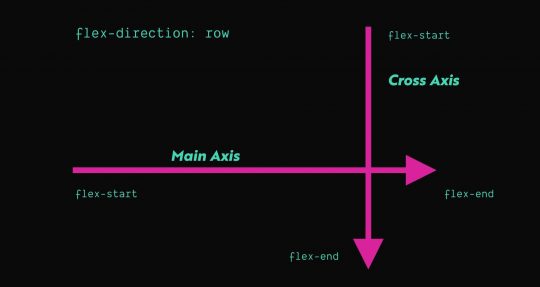
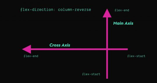
Axis
Flexbox has a concept of Axis which deals with the way items are laid out inside a flex layout. A flex layout has 2 axes: the main axis and cross axis. The flex-direction property determines which axis is the main access and the cross axis is just the opposite of the main axis. By default, flex elements will have a flex-direction of row, which means the main axis will run horizontally from left to right. You can see this visualized in the graphics below.


There are certain Flexbox properties that relate directly to which axis is the main and which is cross. The two main ones you’ll end up using are:
- align-self (View on MDN)
- align-items (View on MDN)
- justify-content (View on MDN)
The first two, align-self and align-items, align flex-items based on the cross axis. So, by default, these will influence the vertical alignment of a single item (align-self) or all flex-items (align-items). The last one justify-content aligns flex-items based on the main axis, so by default, this will deal with horizontal alignment. There are additional options for alignment on the main axis that aren’t available on the cross access, so justify-content has a few other values available than align-items or align-self.
You can use one of these three properties to influence the way the flex-items are aligned on a given axis, which is one of the most common things you’ll end up using Flexbox for. Its great for taking things with different heights and aligning them vertically, or spacing things out evenly inside a container.
Growing and Shrinking
One handy thing that Flexbox can do is help flex-items grow or shrink automatically. This is great for situations when you want an item to take up X amount of space and then another item to take up the remaining space. Essentially, you need to tell the browser which items need to shrink or grow, respectively.
If you want an item to grow or shrink, you need to use the flex-grow or flex-shrink property respectively:
.flex-item--shrink {
    flex-shrink: 1;
}

.flex-item--grow {
    flex-grow: 1;
}
I’ve always found these properties a little confusing because the value you pass to flex-shrink or flex-grow is a number. That number represents the factor by switch the flex-item grows or shrinks. In my experience, you really only need to use a value of 1 in almost all cases. Anything zero or greater is a valid number and by default, a flex-item will have a value of 0 for both flex-grow and flex-shrink.
Using Margin and Width
In Flexbox, the only property that truly can override the width of an item is flex-basis, which represents the starting width of any item. Any shrinking or growing happens after the width of an item is calculated. So if an item has an assigned width and a flex-basis property, flex-basis will take priority.
In all of my research and experience, I have yet to find a scenario where using flex-basis was necessary. If you’re not using both width and flex-basis together, there’s basically no difference between the two. So in short, you don’t need to use it. Just set the width and keep things simple.
Margin is an interesting property in Flexbox. You can use margin not just to create defined amounts of space between elements, but also to do various types of simple alignments, in a way that is easily cross-browser compatible.
One common pattern these days is having a menu where you have one or two buttons that are all the way on the right side, while the rest of the links are left aligned. Say we had some code like this:
<header class="c-header">
 <h1 class="c-header_title">BazingaNet</h1>
 <nav class="c-header_nav">
  <ul class="c-header_menu">
   <li>
    <a href="#">Link</a>
   </li>
   <li>
    <a href="#">Link</a>
   </li>
   <li>
    <a href="#">Link</a>
   </li>
   <li>
    <a href="#">Link</a>
   </li>
   <li class="cta">
    <a href="#">Sign Up</a>
   </li>
   <li class="cta">
    <a href="#">Buy Now</a>
   </li>
  </ul>
 </nav>
</header>
We could use the following CSS to ensure that .cta is pushed as far right as possible by using the following CSS:
.c-header_menu {
  display: flex;
}

/* Target any list item with the class .cta
that follows an li that does NOT have the .cta class
*/
.c-header_menu li:not(.cta) + .cta {
 margin-left: auto;
}
You can of course use things like align-self (which applies to a single flex-item) to do an alignment on the cross axis…but what about the main axis? There is a property called justify-self, but interestingly enough it has no effect in a Flexbox layout. So you can use CSS like the above example to effectively achieve the same result, using our old and trusted friend margin.
See the above example in this CodePen: https://codepen.io/iansvo/pen/ExPxNjV?editors=1100
Practical Flexbox Examples
There are many different ways to approach writing CSS. Let’s consider the example from a few sections above, where we see the different ways you can center an element inside of another one. In the CodePen, we see 4 different ways to vertically center an element inside of a parent. However, the top 2 examples that use absolute positioning are clearly inferior choices to Flexbox in this situation.
Why? The main reason is because Flexbox can do alignment things will still acknowledging the flex-items in the DOM. When you use position: absolute or position: fixed the element is taken out of the document flow, so no other elements will be aware of that positioned element and will handle their layout as if it is not there.
The moral of the story is that some situations warrant using specific approaches to achieve the best result. Flexbox can often be used as a superior alternative to things like floats and absolute positioning. That said, make sure you’re always looking to use the right tool for the job.
Centering Elements
So, one common way to leverage Flexbox is to use it to vertically center things and still allow the parent element to know how tall to be. You can assign an element to have a min-height but then it expand if the content-height exceeds the min-height:
.c-hero {
  display: flex;
  min-height: 100vh;
  padding: 4rem 2rem;
}

.c-hero_content {
  margin: auto;
}
In the above code snippet, the hero content (i.e. the flex-item) will be centered vertically and horizontally. In the event the content height of the hero content exceeds 100vh, the hero section will grow to be as tall as necessary to show all of the hero content.
Consistent Vertical Alignment
Flexbox can also be great for doing vertical alignments. For instance, imagine you have a row of three cards and each one has a different amount of text. You want each card to be the same height and always have the call-to-action (CTA) button in the bottom right. You can use Flexbox and the margin tricks mentioned in the previous section to achieve this effect with zero JavaScript required. Check out the example CodePen to see the effect in action.
Aligning Checkboxes with Labels
Recently I came across a fantastic tweet from Adam Wathan that bemoaned the struggles of aligning text next to a checkbox:
Historically this type of thing has always been difficult to get right without a bunch of minute adjustments and tons of patience. But using Flexbox, you can consistently and easily achieve this holy grail of checkbox alignment by leveraging Flexbox and something called a “zero-width space character” (​ – read more). This is accomplished by the following:
- Wrapping the checkbox input in a flex container and setting
align-itemstocenter. - Adding the zero-width space character next to the checkbox input.
- Giving the flex container the same line-height and font-size as the adjacent label.
- Wrapping both the checkbox flex container and the label inside another flex container with
align-itemsset toflex-start
<div class="example">
<div class="flex-container items-start">
<div class="flex-container items-center">
​ <!-- Zero width space character -->
<input id="option4" type="checkbox">
</div>
<label for="option4">Longer checkbox item that unfortunately wraps on to two separate lines</label>
</div>
</div>
<style>
.flex-container {
display: flex;
}
.items-start {
align-items: flex-start
}
.items-center {
align-items: center;
}
</style>Adam’s technique is a fantastic and reliable way to solve a very common layout problem. You can view a complete example of this in Adam’s CodePen.
Keeping the footer at the bottom of the viewport
Imagine you have a page that has a small-ish amount of content. You pull it up on a 27″ 2k resolution monitor. The content height is only about 30% of the monitor’s height, so now the footer is awkwardly high up on the page.
If you’re using HTML5 sectioning elements already, you may not need to change your markup at all. Consider the following code:
<body>
  <header>
    ...
  </header>
  <main>
    ...
  </main>
  <footer>
    ...
  </footer>
</body>
Using a few lines of CSS, you can force the footer to the bottom by using flex-grow and flex-direction: column; to allow the main element to expand to fill the extra space. See example CodePen: https://codepen.io/iansvo/pen/jOWOVNX
Equalizing Content Sections
Consider a 3 up card layout, where each card has an image, a title, some text, and a button:
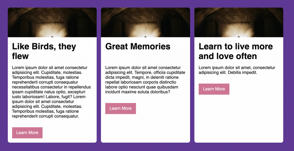
When making cards, it’s often desirable to have things like CTA buttons in a consistent position so they’re easily found by users. Flexbox is automatically helping the columns be the same height so the cards are all uniform in that sense. Next, we need a way to overcome the height differences in the card content.
Your first instinct might be to set the content area to have the same height. In days of yore, if you wanted to force elements to have the same dynamic height, you’d have to use JavaScript. This is still largely true today, but that seems a little heavy-handed for our case here. We don’t really care about the height of that content area, we really just care about the position of the button.
Similar to the nav example provided earlier, we can use align-self or margin to allow the button to display in the desired position. We can do this using simple HTML structures and CSS. Consider the card markup below:
<div class="card">
  <img class="card_image" src="//picsum.photos/300/100" alt="placeholder image" width="300" height="100">
  <div class="card_content">
    <h1>Like Birds, they flew</h1>
    <p>Lorem ipsum ...</p>
    <a class="card_button" href="#">
      Learn More
    </a>
  </div>
</div>
Right now, card element is a flex container and the card_content element is set to flex-grow: 1, so it is already taking up the remaining space below the headline. From here, we set card_content to also be a flex container with a flex direction of column, since the child elements are all supposed to be stacked. Now we can use margin to force the card_button element to the bottom right corner:
.card_button {
  margin-left: auto;
  margin-top: auto;
}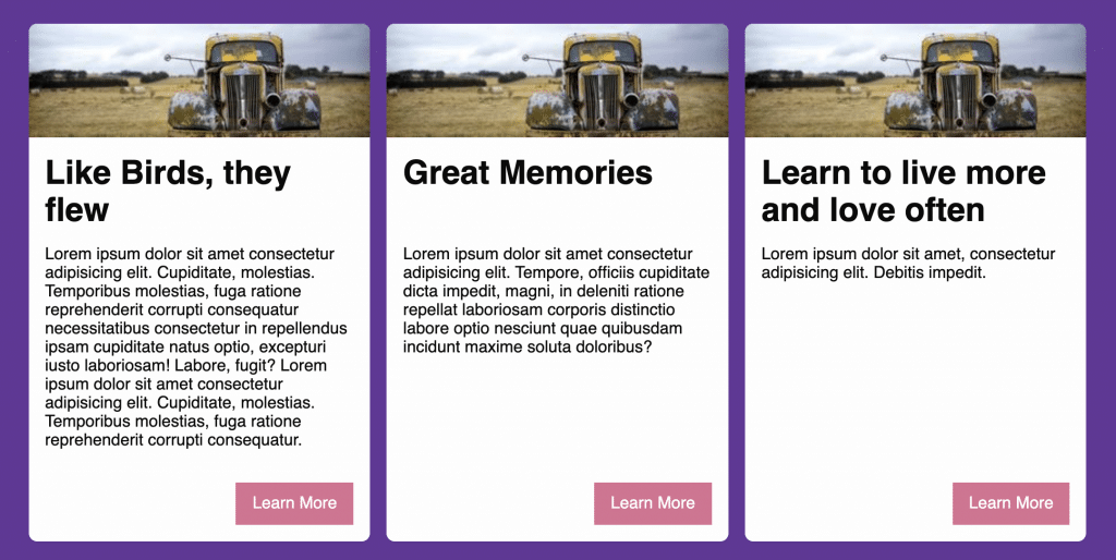
You can view a Codepen with the code here: https://codepen.io/iansvo/pen/dyYByGy?editors=0110.
Next Steps
What other things can you do with Flexbox? The answer is as much as your imagination can think of! The Flexbox algorithm can be quite powerful and do things that in the past would’ve required JavaScript. Flexbox can allow you to do things much faster than you could’ve in the past, however, it has some quirks and certain properties have less browser support than others.
I would recommend using only the parts of Flexbox you actually need to use and carefully consider if it’s the best thing to solve your current layout problem. If you use the best tool for the job, you’ll find that you spend way less time fighting the layout and more time actually making things how you like them.